
That’s the eerie graffiti I found in an old abandoned sanatorium on the Connecticut seaside. Which one do you like better: color or black&white?
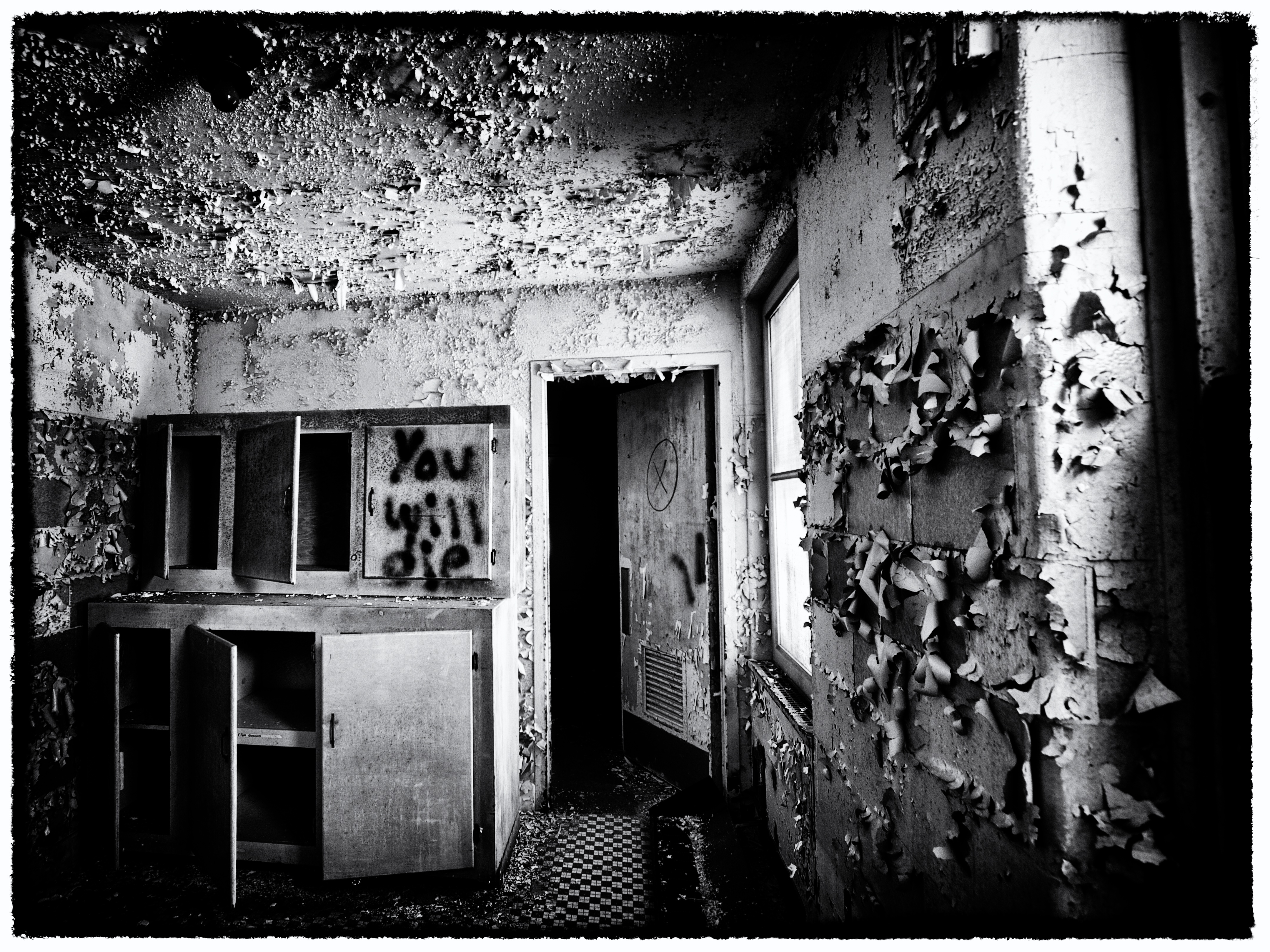
Canon EOS 7D, 10-22mm f/3.5-4.5
ISO 100
10mm
f/4.5
1/4 sec
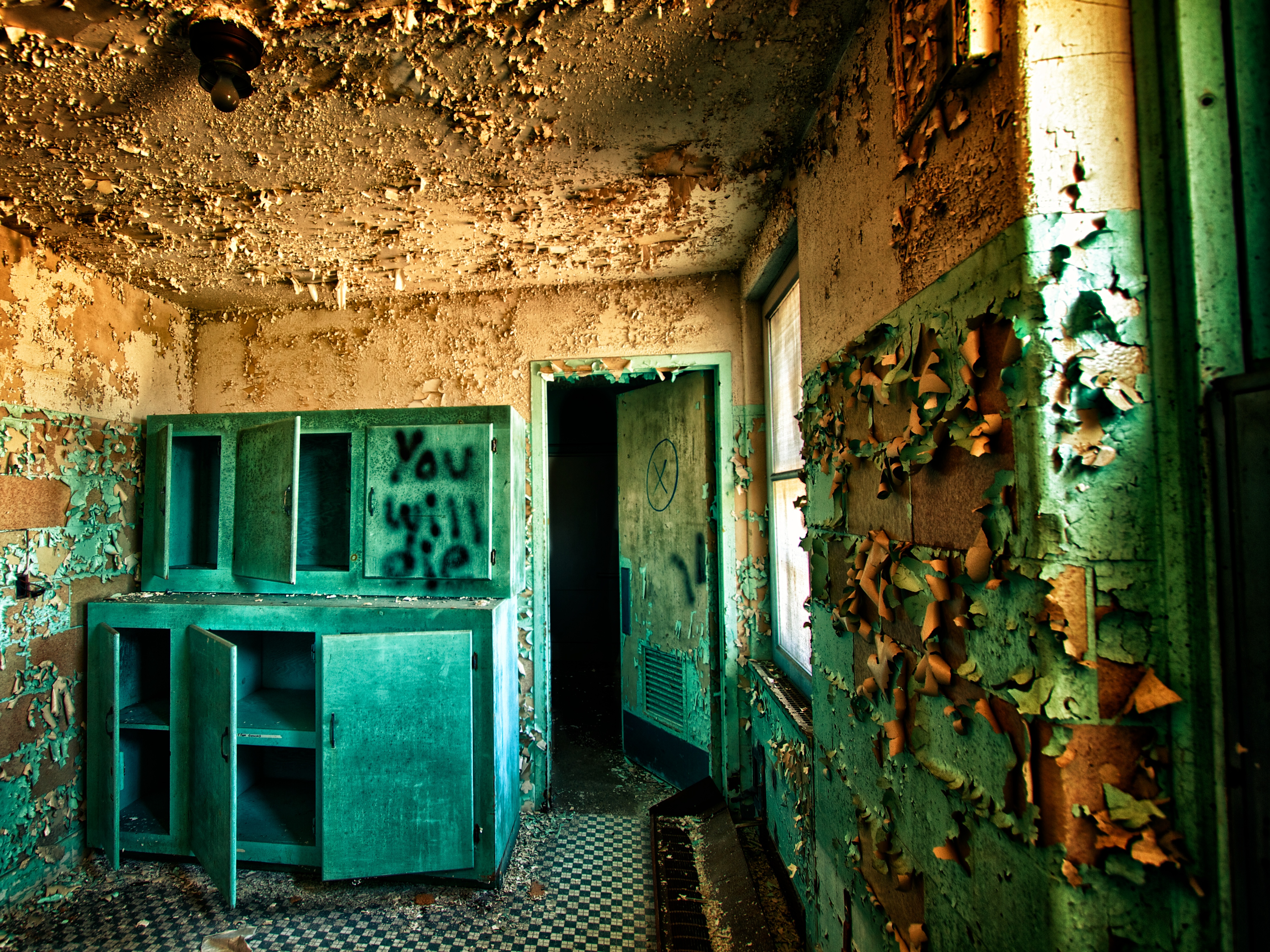
That’s the eerie graffiti I found in an old abandoned sanatorium on the Connecticut seaside. Which one do you like better: color or black&white?
Canon EOS 7D, 10-22mm f/3.5-4.5
ISO 100
10mm
f/4.5
1/4 sec
Posted April 27, 2013 by Lutz Braum in Architecture, Black&White, US
Tagged with Architecture, B&W, Black & White, canon eos 7d, Connecticut, HDR, photography
Subscribe to comments with RSS.
This site uses Akismet to reduce spam. Learn how your comment data is processed.


There’s something cheery and eerie at the same time, with the color version.
I see you made it! The color has more of a sense of unreality – maybe the CCD/HDR take on the institutional green – also I like the additional detail in the left side of the cabinets – you still get the sense of foreboding with the darkness on the other side of the door. Both are great shots in either case.
I would go for the colour version..somehow adds to the abandonment, for me. Thanks for visiting my blog!
Color. Creating an ominous tone with B&W is easier but you’ve done it marvelously well in color. Much harder. Well done!
That’s a good point, I had not considered that. Always happy to learn something from fellow photographers. Thank you!
Hmm, not all that prophetic for any of us eventually, is it? But, the tinted version made it seem like a more colorful event. I like the way you’ve captured the textured effect of the peeling, in either instance.
Pingback: Abandoned and Haunted Sanatorium | Snapshots For Sore Eyes
B/W definitely-it really draws the viewer into the scene and I think it adds atmosphere. At any rate, a great image!
Thank you too for stopping by Move the Chair-I appreciate you taking the time to look-
B&W !